Layouts
Basics of Form Builder theme layouts.
Please hold on while we update this article with the latest information. Until then, you can take a closer look at the new theme object, located in the apps/theme/theme.ts 
- what are Form Builder theme layouts
- how to use layouts in forms
- how to create a new layout
Overview
In this section, you learn all about the Form Builder theme layouts.
Every form you create via the Form Builder app has a layout, which lets you define the design of your forms.
Because the form layout is a React component, there are virtually no restrictions when it comes to adding customizations. Feel free to organize the code to your liking, import custom CSS, fonts, or even additional custom React components if there’s a need for it.
Using Layout in Forms
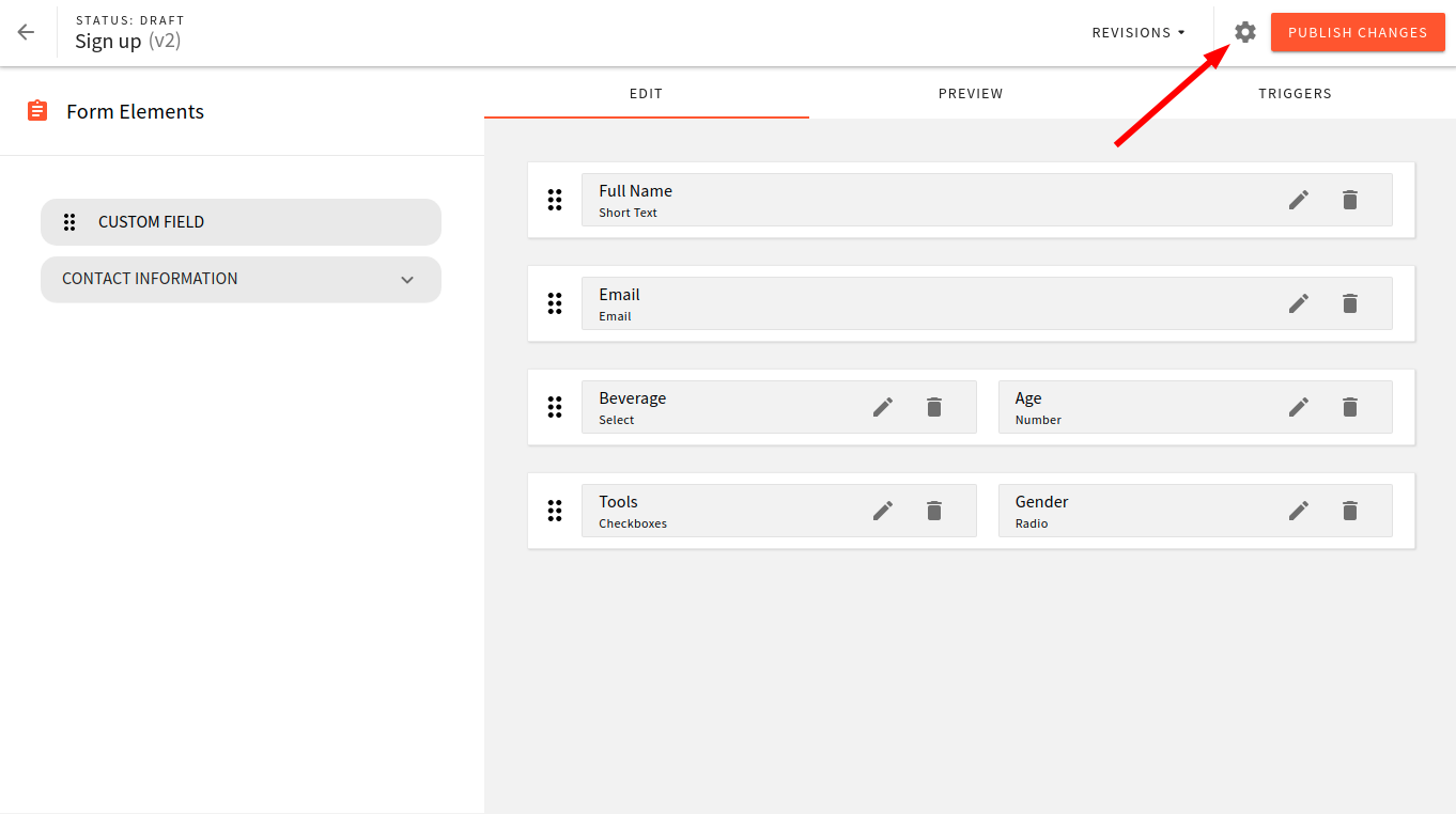
Be default, every form has a default layout, which can be changed via the form settings. In the Form Builder, click on the settings icon in the top right corner:
 Webiny form settings button
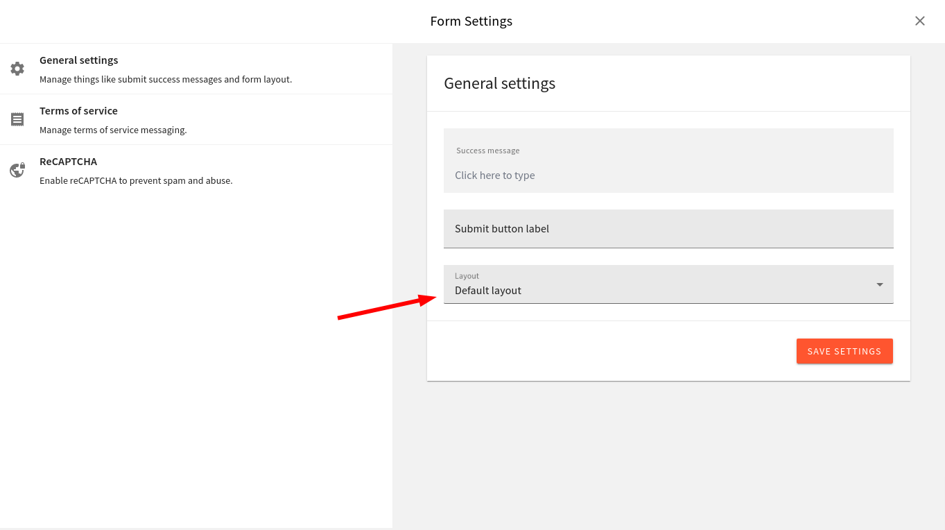
You should then see the following screen, and the “Layout” field at the bottom of the general settings form:
 Webiny form settings button
Please note that a single form layout can be used on any number of forms, but every single form can use only one layout.
Anatomy of Form Layout
Let’s take a closer look at the structure of a form layout and its component.
Plugin
The following snippet of code shows how to add a new form layout via a simple plugin:
import DefaultFormLayout from "./layouts/DefaultFormLayout";

export default [
  {
    name: "form-layout-default",
    type: "form-layout",
    layout: {
      name: "default",
      title: "Default layout",
      component: DefaultFormLayout
    }
  }
];
The plugin is defined once but must be registered both in your admin and website apps. It enables you to do both:
- see the form preview in the Form Builder editor
- and show your form on the actual website
The Form Builder theme is located in the apps/theme 
apps/admin 
apps/admin
The following table shows a list of all keys and values that the plugin must define:
| Key | Value Type | Description |
|---|---|---|
name | string | Unique plugin name. |
type | string | Plugin type must equal to form-layout. |
layout | Object | Object containing a unique name for the theme, a human-readable title, and a reference to the actual React component that is used to render the form. |
Form Layout React Component
To get a better feeling of what’s expected of a single form layout component, you can check out the default layout component, located at:
apps/theme/formBuilder/layouts/DefaultFormLayout.tsx
If needed, feel free to edit the file to your liking, or just create a copy and, use that as a foundation for a new form layout.
Form Layout Component's Props
| Prop | Type | Description |
|---|---|---|
getFieldById | Function | Returns a single form field by given ID. |
getFields | Array<Array<FormRenderFieldType>> | Returns a list of all form fields. |
getDefaultValues | Object | Returns default values for all form fields. |
ReCaptcha | ReCaptchaComponentType | A components that shows Google reCAPTCHA, a simple check that prevents you from spammers and bots (only if enabled via form settings). |
TermsOfService | TermsOfServiceComponentType | A component that shows terms of service message (only if enabled via form settings). |
submit | (data: Object) => Promise<FormSubmitResponseType> | Call this callback to submit the form. |
formData | FormDataType | Contains data about the form, for example, form name, layout, settings, and so on. |
Add a New Form Layout
You can add a new form layout in the Form Builder app in these two simple steps:
- create a React component that contains all the logic related to the layout
- then, register it as a
form-layoutplugin
Create Layout Component
Let’s start with creating a React component for our form layout.
First copy over the content of the DefaultFormLayout component and make the following changes:
import { ReactComponent as OnlineIcon } from "./images/online-bro.svg";
import { css } from "emotion";

(...)

// Some code is removed for the sake of brevity
const artClass = css(`
  display: flex;
  justify-content: center;
  svg {
    width: 200px;
  }
`);
const containerClass = css(`background-color: #cadaf6; padding: 8px 16px`);

const SimpleFormLayout: FormLayoutComponent = ({
  getFields,
  getDefaultValues,
  submit,
  formData,
  ReCaptcha,
  TermsOfService
}) => {

  return (
    <div className={containerClass + " webiny-fb-form-layout-simple"}>
      {/* A simple Image */}
      <div className={artClass}>
          <OnlineIcon />
      </div>
      {/* "onSubmit" callback gets triggered once all of the fields are valid. */}
      {/* We also pass the default values for all fields via the getDefaultValues callback. */}
      <Form onSubmit={submitForm} data={getDefaultValues()}>
          {/* ... */}
      </Form>
    </div>
  );
};

export default SimpleFormLayout;
Also, make the following style changes to make our layout stand apart:
(...)

.webiny-fb-form-layout-simple .webiny-fb-form {
  background-color: #cadaf6;

  .webiny-fb-form-field {
    background-color: #cadaf6;
  }
}
Register the New Form Layout
Now that you have your newly created React component in place,
let’s register a new form layout plugin:import DefaultFormLayout from './layouts/DefaultFormLayout'import SimpleFormLayout from './layouts/SimpleFormLayout'
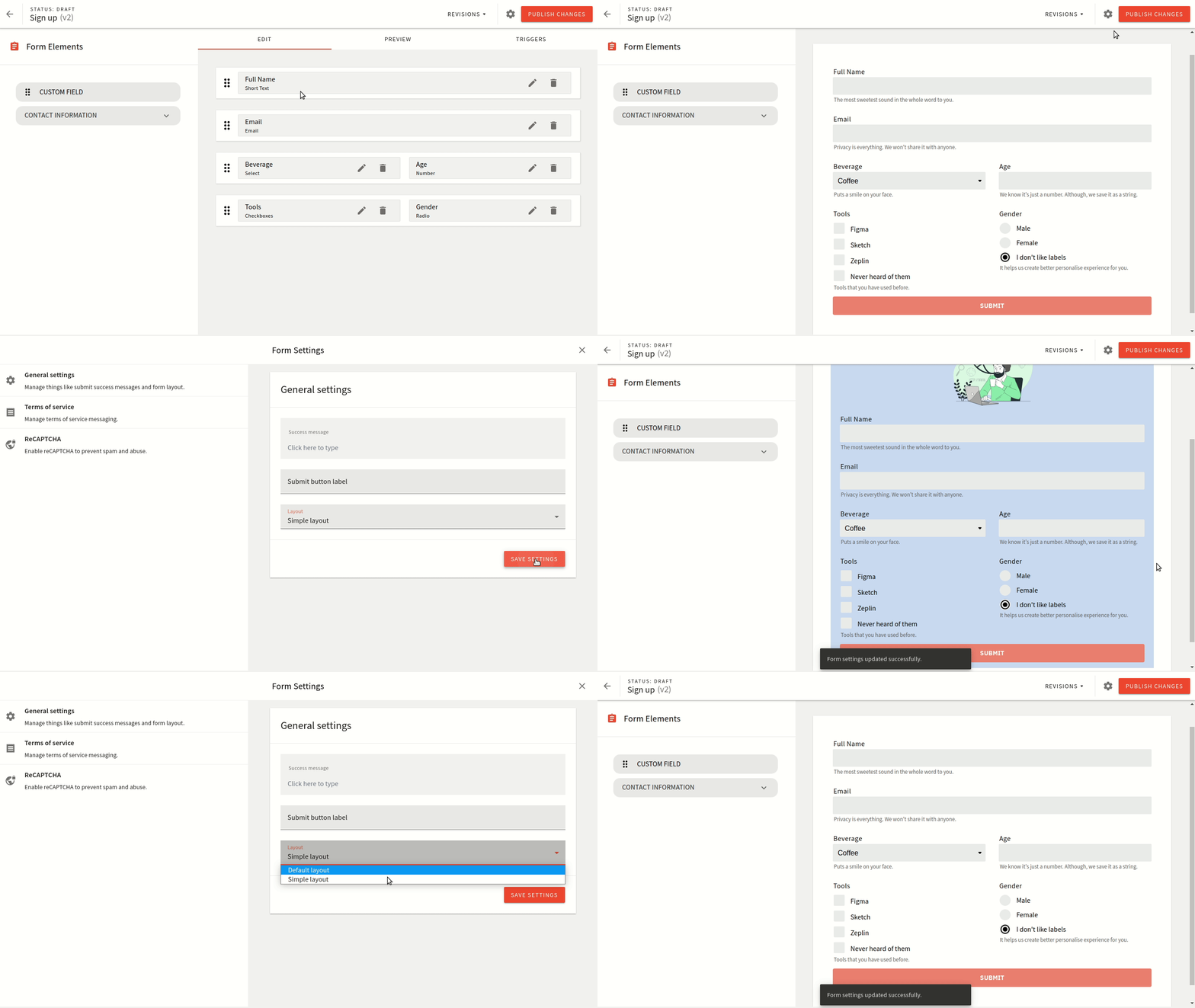
export default [{ name: 'form-layout-default', type: 'form-layout', layout: { name: 'default', title: 'Default layout', component: DefaultFormLayout, },},{ name: 'form-layout-simple', type: 'form-layout', layout: { name: 'simple', title: 'Simple layout', component: SimpleFormLayout, },},]After making these changes head over to the Form Builder app and try using your newly added form layout.
 Webiny form builder preview