Create a Custom Page Element
Learn how to create a custom page element that can be rendered on pages created with the Webiny's Page Builder app.
- how to create a custom page Builder element
- how to register plugins in Webiny applications
The full code example used in this article is available in our
webiny-examples  GitHub
repository.
GitHub
repository.
Introduction
Out of the box, Webiny’s Page Builder app provides a plethora of ready-made page elements we can use to create both simple and complex pages for our website. Furthermore, on top of the default set, users can also create their custom page elements, which is what this article demonstrates.
In this short article, we create a relatively simple page element that allows users to show a list of different SpaceX rocket and dragon spacecrafts. Here’s what the final result will look like:
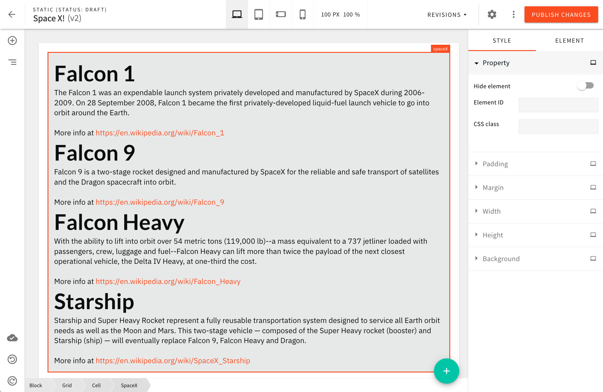 SpaceX Page Element
The custom page element will be available from the Media page elements category:
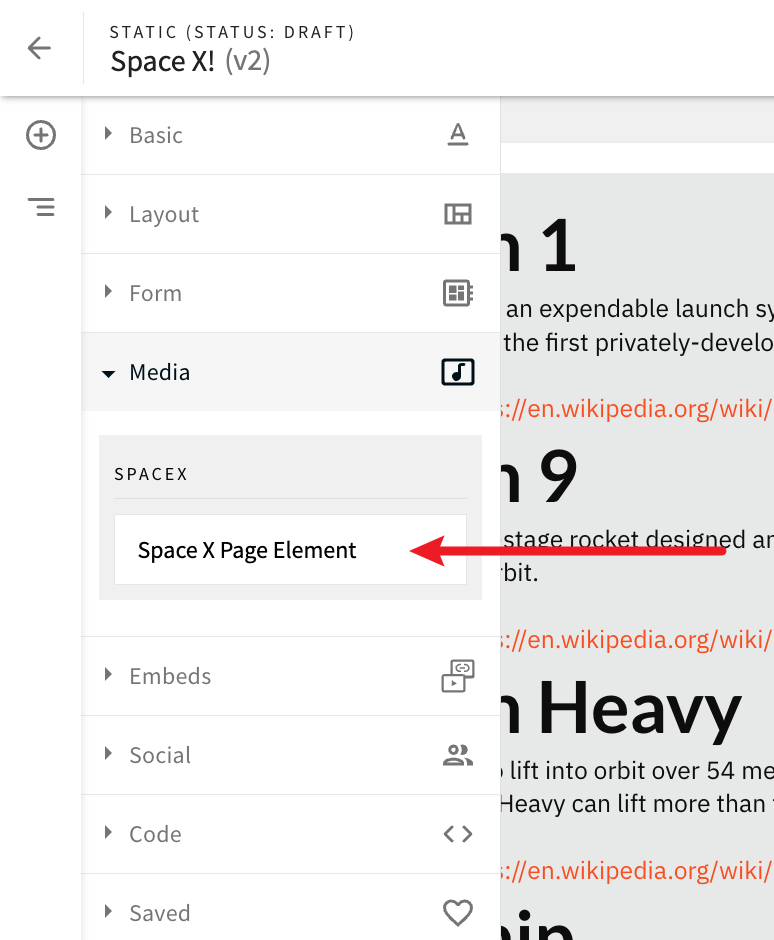 SpaceX Page Element in the Elements Menu (Media category)
Also, upon dropping the element onto a page, users will have the ability to adjust the following three settings:
- type of spacecrafts to be displayed (rockets or dragons)
- number of spacecrafts to be displayed
- pagination offset (number of spacecrafts we want to skip when retrieving the data)
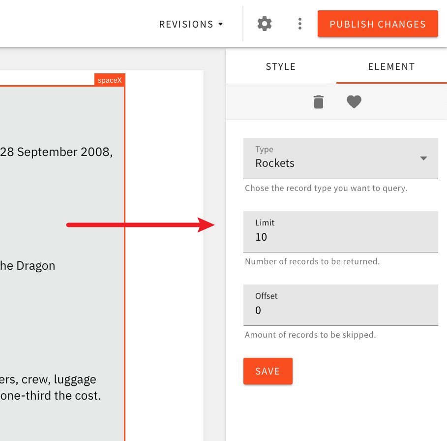 SpaceX Page Element in the Elements Menu (Media category)
Note that the spacecrafts data will be retrieved from a non-official public SpaceX GraphQL HTTP API, located at https://spacex-production.up.railway.app/ . Meaning, changing these settings will dictate the variables that will be included in GraphQL queries issued by the page element. More on this in the following sections.
Getting Started
Renderer React Component
To create a custom page element, we first need to create a renderer React component which, as the name itself suggests, renders it. As we’ll be able to see, this is easily achieved via the createRenderer factory function.
Plugins
Via a couple of plugins, the next step is registering the renderer React component within our project’s Admin and Website apps.
In case you missed it, the Admin and Website apps are located in the apps/admin and apps/website folders of an existing Webiny project.
On the Admin app side, we first register the PbEditorPageElementPlugin plugin, which enables us to introduce our custom page element into the Page Builder’s page editor and enables users to drop the new element onto a page.
After that, optionally, we register the PbEditorPageElementAdvancedSettingsPlugin plugin, which lets us define all the related settings that are available to users upon dropping the page element onto a page. Since the page element we’re building does contain settings that the user can adjust, we will need this plugin as well.
When it comes to the Website app, here we register the PbRenderElementPlugin plugin. With it, we ensure our renderer React component is utilized upon serving a published page to an actual website visitor. Note we’ll also need this plugin on the Admin app side because previewing pages is possible there too, outside the page editor.
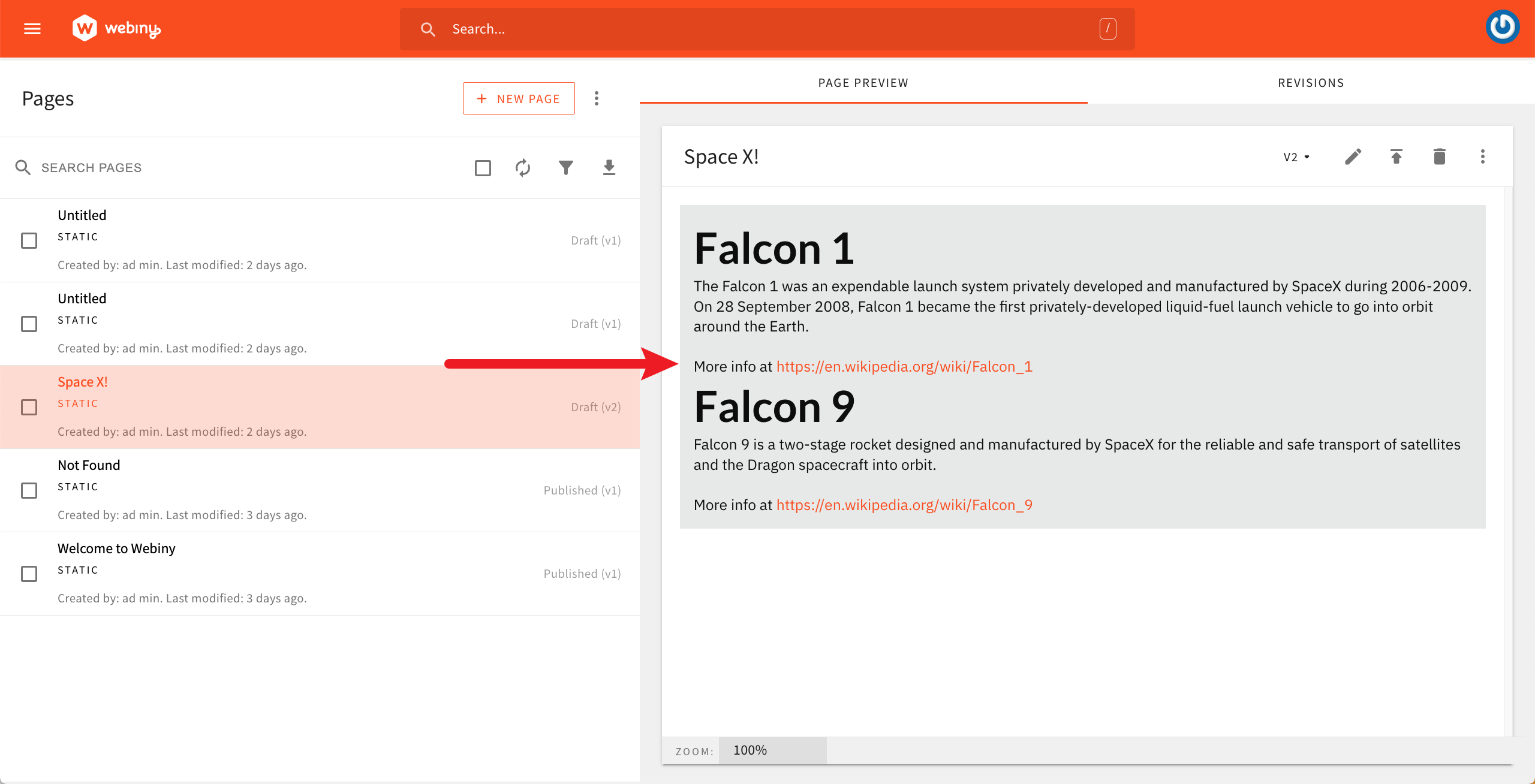 Page Preview In the Admin App
Code Organization
There are multiple approaches when it comes to where to place our custom page element code. In this tutorial, we will be placing all the code in the apps/theme folder. More specifically, we’ll create a new apps/theme/pageElements folder, and inside it, the new apps/theme/pageElements/spaceX folder.
The
apps/theme/pageElements
folder can be further used as a folder for all of your custom page elements.
Overview of Files
Ultimately, in the apps/theme/pageElements/spaceX folder, we’ll end up with the following three files:
SpaceX.tsx - contains the renderer React componentadmin.tsx - contains the Admin app pluginswebsite.ts - contains the Website app plugin
Useful Webiny CLI Commands
For easier development, both Admin and Website apps can be run and developed locally. This is done via the following two webiny watch commands:yarn webiny watch admin --env YOUR_ENVyarn webiny watch website --env YOUR_ENVIf needed, both commands can be run at the same time, via two separate terminal sessions.
Implementation
Renderer React Component
As previously mentioned, in order to create a custom page element, we start off by creating a new renderer React component. We create the apps/theme/pageElements/spaceX/SpaceX.tsx file with the following code:
import React, { useEffect, useState } from "react";
import { request } from "graphql-request";
import { createRenderer, useRenderer } from "@webiny/app-page-builder-elements";
// For simplicity, we're hard-coding the GraphQL HTTP API URL here.
const GQL_API_URL = "https://spacex-production.up.railway.app/";
// These are the necessary GraphQL queries we'll need in order to retrieve data.
const QUERIES = {
rockets: /* GraphQL */ `
query listRockets($limit: Int, $offset: Int) {
data: rockets(limit: $limit, offset: $offset) {
id
name
description
wikipedia
}
}
`,
dragons: /* GraphQL */ `
query listDragons($limit: Int, $offset: Int) {
data: dragons(limit: $limit, offset: $offset) {
id
name
description
wikipedia
}
}
`
};
export interface Spacecraft {
id: string;
name: string;
description: string;
wikipedia: string;
}
// It's often useful to type the data that the page element will carry.
export interface SpaceXElementData {
variables: {
limit: string;
offset: string;
type: "rockets" | "dragons";
};
}
// The renderer React component.
export const SpaceX = createRenderer(() => {
// Let's retrieve the variables that were chosen by
// the user upon dropping the page element onto the page.
const { getElement } = useRenderer();
const element = getElement<SpaceXElementData>();
const { limit, offset, type } = element.data.variables;
const [data, setData] = useState<Spacecraft[]>([]);
// This is where we fetch the data and store it into component's state.
useEffect(() => {
request(GQL_API_URL, QUERIES[type], {
limit: parseInt(limit),
offset: parseInt(offset)
}).then(({ data }) => setData(data));
}, [limit, offset, type]);
if (!data.length) {
return <>Nothing to show.</>;
}
// If the data has been retrieved, we render it via a simple unordered list.
return (
<ul>
{data.map(item => (
<li key={item.id}>
<h1>{item.name}</h1>
<div>{item.description}</div>
<br />
<div>
More info at
<a href={item.wikipedia} target={"_blank"} rel={"noreferrer"}>
{item.wikipedia}
</a>
</div>
</li>
))}
</ul>
);
});Note that, for simplicity’s sake, all the code is placed in a single file. Of course, it is possible to organize it across multiple files, if preferred.
Furthermore, in order to be able to issue remote GraphQL queries, we introduce the graphql-request package. The package can be installed via the following command, run from your project root:
yarn workspace theme add graphql-requestWith this code in place, we’re ready for the next step, which is registering the renderer React component within our Admin and Website apps. We’ll start with the Website app, as the plugin that we’ll create here will also be needed within the Admin app.
Website App
As previously mentioned, ensuring our custom renderer React component is actually used upon rendering a published page is done via the PbRenderElementPlugin plugin. For this, we’ll create a new apps/theme/pageElements/spaceX/website.ts file with the following code:
import { PbRenderElementPlugin } from "@webiny/app-page-builder/types";
import { SpaceX } from "./SpaceX";

const plugin = {
  name: "pb-render-page-element-space-x",
  type: "pb-render-page-element",
  elementType: "spaceX",
  render: SpaceX
} as PbRenderElementPlugin;

export default plugin;
With this plugin in place, we need to register it within the Website app. This can be achieved via the apps/website/src/plugins/pageBuilder.ts file:
// The rest of code was removed for brevity.import spaceX from "theme/pageElements/spaceX/website";
// ...
export default [  // ...  spaceX  // ...];
With the plugin registered, we’re ready to move on to the next step, and that is the Admin app.
Admin App
As previously mentioned, within the Admin app, we need two plugins: PbEditorPageElementPlugin and PbEditorPageElementAdvancedSettingsPlugin .
For simplicity’s sake, we’ll again place all the code in a single file, this time in apps/theme/pageElements/spaceX/admin.tsx :
import React from "react";
import { validation } from "@webiny/validation";
import { Input } from "@webiny/ui/Input";
import { ButtonPrimary } from "@webiny/ui/Button";
import { Cell, Grid } from "@webiny/ui/Grid";
import { Select } from "@webiny/ui/Select";
import {
  PbEditorPageElementAdvancedSettingsPlugin,
  PbEditorPageElementPlugin
} from "@webiny/app-page-builder/types";

import { SpaceX, SpaceXElementData } from "./SpaceX";

const INITIAL_ELEMENT_DATA: SpaceXElementData = {
  variables: { type: "rockets", limit: "10", offset: "0" }
};

export default [
  // The `PbEditorPageElementPlugin` plugin.
  {
    name: "pb-editor-page-element-space-x",
    type: "pb-editor-page-element",
    elementType: "spaceX",
    render: SpaceX,
    toolbar: {
      // We use `pb-editor-element-group-media` to put our new
      // page element into the Media group in the left sidebar.
      title: "SpaceX",
      group: "pb-editor-element-group-media",
      preview() {
        // We can return any JSX / React code here. To keep it
        // simple, we are simply returning the element's name.
        return <>Space X Page Element</>;
      }
    },

    // Defines which types of element settings are available to the user.
    settings: [
      "pb-editor-page-element-settings-delete",
      "pb-editor-page-element-settings-visibility",
      "pb-editor-page-element-style-settings-padding",
      "pb-editor-page-element-style-settings-margin",
      "pb-editor-page-element-style-settings-width",
      "pb-editor-page-element-style-settings-height",
      "pb-editor-page-element-style-settings-background"
    ],

    // Defines onto which existing elements our element can be dropped.
    // In most cases, using `["cell", "block"]` will suffice.
    target: ["cell", "block"],
    onCreate: "open-settings",

    // `create` function creates the initial data for the page element.
    create(options) {
      return {
        type: "spaceX",
        elements: [],
        data: INITIAL_ELEMENT_DATA,
        ...options
      };
    }
  } as PbEditorPageElementPlugin,

  // The `PbEditorPageElementAdvancedSettingsPlugin` plugin.
  {
    name: "pb-editor-page-element-advanced-settings-space-x",
    type: "pb-editor-page-element-advanced-settings",
    elementType: "spaceX",
    render({ Bind, submit }) {
      // In order to construct the settings form, we're using the
      // `@webiny/form`, `@webiny/ui`, and `@webiny/validation` packages.
      return (
        <>
          <Grid>
            <Cell span={12}>
              <Bind name={"variables.type"}>
                <Select label={"Type"} description={"Chose the record type you want to query."}>
                  <option value="rockets">Rockets</option>
                  <option value="dragons">Dragons</option>
                </Select>
              </Bind>
            </Cell>
            <Cell span={12}>
              <Bind
                name={"variables.limit"}
                validators={validation.create("required,gte:0,lte:1000")}
              >
                <Input
                  label={"Limit"}
                  type="number"
                  description={"Number of records to be returned."}
                />
              </Bind>
            </Cell>
            <Cell span={12}>
              <Bind
                name={"variables.offset"}
                validators={validation.create("required,gte:0,lte:1000")}
              >
                <Input
                  label={"Offset"}
                  type="number"
                  description={"Amount of records to be skipped."}
                />
              </Bind>
            </Cell>
            <Cell span={12}>
              <ButtonPrimary onClick={submit}>Save</ButtonPrimary>
            </Cell>
          </Grid>
        </>
      );
    }
  } as PbEditorPageElementAdvancedSettingsPlugin
];
Before we register these plugins, note that, in order to construct the settings form, we’re using the @webiny/form , @webiny/ui , and @webiny/validation packages. Since the @webiny/ui is not installed within the apps/theme package by default, we need to install it. This can be done via the following command, run from your project root:
yarn workspace theme add @webiny/uiWhen it comes to plugin registration, in total, there are three plugins we need to register within the Admin app. The two shown above, plus the previously created PbRenderElementPlugin plugin. The PbRenderElementPlugin is required because, as mentioned, pages can also be previewed within the Admin app, outside the page editor.
Page Preview In the Admin AppWe register the two plugins via the apps/admin/src/plugins/pageBuilder/editorPlugins.ts file:
// Some of the code was removed for brevity.import spaceX from "theme/pageElements/spaceX/admin";
// ...
export default [  // ...  spaceX  // ...];
The PbRenderElementPlugin plugin can be registered via the apps/admin/src/plugins/pageBuilder/renderPlugins.ts file:
// The rest of code was removed for brevity.import spaceX from "theme/pageElements/spaceX/website";
// ...
export default [  // ...  spaceX  // ...];
With all the plugins registered, we’re now ready to give this a try locally in our browser.
Testing
With the above steps correctly completed, we should be able to see our custom page element in Page Builder’s page editor and be able to drop it onto a page. The page element should also be correctly rendered when previewing the page, and also on the public website, once the page has been published.
Conclusion
Creating custom page elements is certainly an interesting option when users need more than what the default set of page elements provides.
On the code level, this could be creating completely custom (renderer) React components, including needed external NPM libraries, or even issuing remote HTTP requests to external HTTP APIs in order to retrieve data from standalone external systems.
On the other hand, custom page elements also add additional flexibility by allowing content creators to tweak elements’ settings and, ultimately, allowing them to achieve more with just a single page element.
Additional Examples